Life Limiting Components
Life Limiting Components | Details limited due to confidentiality requirements from defense contracting work
Role
UX Designer
Industry
Aerospace
Duration
3 months

Overview
This space monitoring application aimed to provide operators (users) with real-time, historical and predictive data on space vehicles. One critical feature of this application are the life-limiting components, which allow operators to understand the lifespan and health of vital components on space vehicles.
Design challenges included; conveying the significance of life limiting components to users, displaying complex data in an understandable manner, and integrating seamlessly within our rigid application structure.
As a UX designer, my objective was to redesign the Life Limiting Components feature to address these challenges and enhance user understanding and interaction.
Synthesized research findings to develop a clear value proposition for the app, focusing on unique features such as group dining options, personalized restaurant recommendations, and event planning capabilities.
Discovery
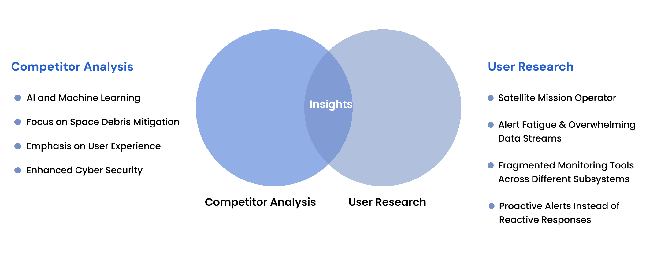
Competitive Analysis and User Research Key Takeaways
Alert Fatigue
Both competitive analysis and user research confirm that overwhelming alert systems are a major issue.
Large-scale alerting systems
lack effective prioritization mechanisms
Unified Data Views
Both competitive analysis and user research identify inefficiencies due to fragmented dashboards.
Exploring Solutions
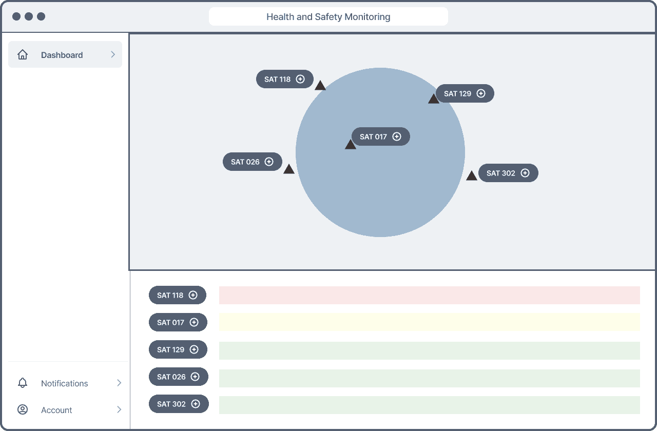
Iteration 1 - Interactive Globe
I wanted to incorporate a separate product within ours to create an interactive globe to see destinations of satellites and their distance travelled vs planned, AI for alerts that would populate on the side bar, and more
Findings
- Lacked adaptability or increased complexity
-Significant Technical complexities
+ Intuitive color coding
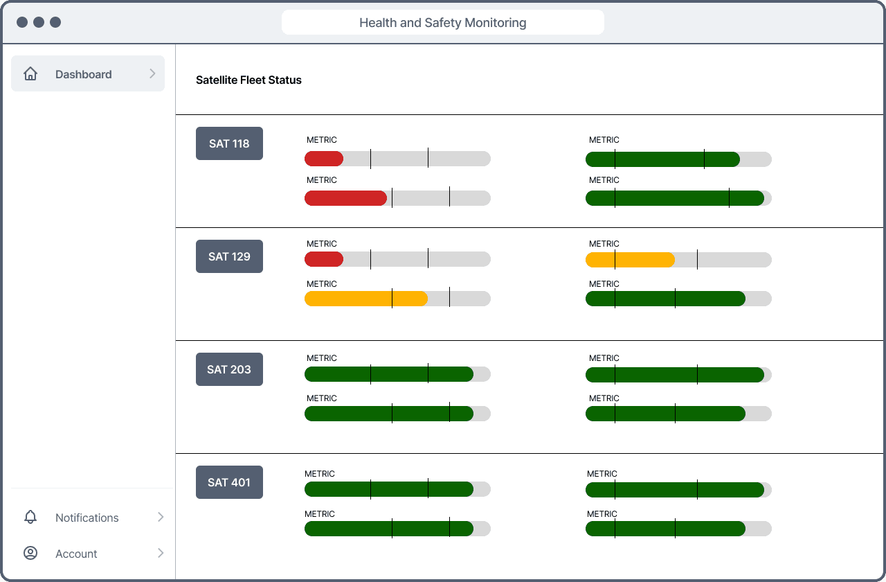
Iteration 2 - Data First Approach
The idea was to lay all the information out on the page to organized. This was optimized for each piece of information to show at all times.
Findings
- Limits expanding data set visuals
- Information Overloaded with too granular of information
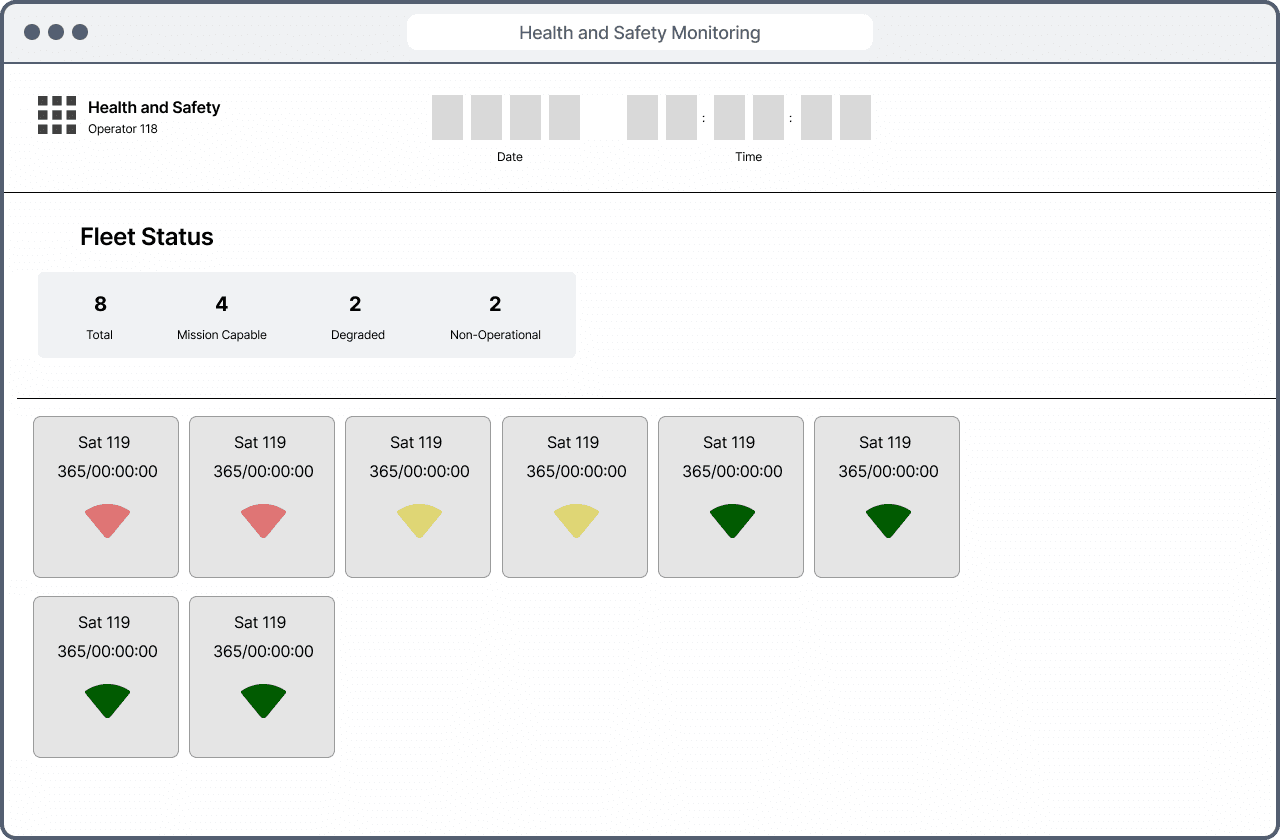
Iteration 3 - High Level Information
Where the design really took shape. With user insight, I was able to identify information and rate them from what was actually useful in the first stage of reviewing the operator satellites. This step was crucial in the shape of how the following pages were structured. With a prioritized view of satellites ranking from "Non-Operational" to "Mission Capable". This gave users the ability to quickly identify the amount of satellites that were available to accomplish tasks.
Final Designs
According to user feedback surveys showed 83% improvement in ease of use for the updated interface. Operators reduced the time to diagnose issues by 30% due to streamlined data visualization and prioritized alerts. Managers are able to see improved mission oversight without needing to dive into granular technical details.
Overview
This space monitoring application aimed to provide operators (users) with real-time, historical and predictive data on space vehicles. One critical feature of this application are the life-limiting components, which allow operators to understand the lifespan and health of vital components on space vehicles.
Design challenges included; conveying the significance of life limiting components to users, displaying complex data in an understandable manner, and integrating seamlessly within our rigid application structure.
As a UX designer, my objective was to redesign the Life Limiting Components feature to address these challenges and enhance user understanding and interaction.
Synthesized research findings to develop a clear value proposition for the app, focusing on unique features such as group dining options, personalized restaurant recommendations, and event planning capabilities.
Discovery
Competitive Analysis and User Research Key Takeaways
Alert Fatigue
Both competitive analysis and user research confirm that overwhelming alert systems are a major issue.
Large-scale alerting systems
lack effective prioritization mechanisms
Unified Data Views
Both competitive analysis and user research identify inefficiencies due to fragmented dashboards.
Exploring Solutions
Iteration 1 - Interactive Globe
I wanted to incorporate a separate product within ours to create an interactive globe to see destinations of satellites and their distance travelled vs planned, AI for alerts that would populate on the side bar, and more
Findings
- Lacked adaptability or increased complexity
-Significant Technical complexities
+ Intuitive color coding
Iteration 2 - Data First Approach
The idea was to lay all the information out on the page to organized. This was optimized for each piece of information to show at all times.
Findings
- Limits expanding data set visuals
- Information Overloaded with too granular of information
Iteration 3 - High Level Information
Where the design really took shape. With user insight, I was able to identify information and rate them from what was actually useful in the first stage of reviewing the operator satellites. This step was crucial in the shape of how the following pages were structured. With a prioritized view of satellites ranking from "Non-Operational" to "Mission Capable". This gave users the ability to quickly identify the amount of satellites that were available to accomplish tasks.
Final Designs
According to user feedback surveys showed 83% improvement in ease of use for the updated interface. Operators reduced the time to diagnose issues by 30% due to streamlined data visualization and prioritized alerts. Managers are able to see improved mission oversight without needing to dive into granular technical details.
Other projects

Connection Uninterrupted
The strength in community relies on the ability to connect and communicate with not only ourselves but others. Details limited due to confidentiality requirements from defense contracting work.

Application Marketplace
An integrated application marketplace for Marketers to download, configure and use 3rd party tools to create comprehensive campaigns.